SaaS metrics even your CFO trusts.
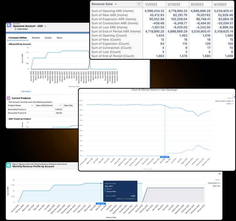
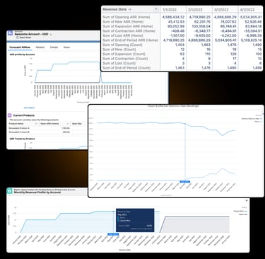
For real-time ARR, MRR, Churn, and more, ForecaaS ARRow is the powerful and endlessly customizable answer for reliably accurate recurring revenue metrics once and for all.
No spreadsheets. No shaky in-house builds.
Available exclusively through Salesforce AppExchange.
For RevOps
Supercharge your RevOps team and remove the 20+ frustrating hours a month it takes to manually calculate and analyze your core recurring revenue metrics.
Quickly make data-backed funding decisions and avoid the time-consuming battle of working with organizations without a standardized way of proving their revenue streams.
Get the funding you need to scale by consistently providing trustworthy revenue metrics to potential investors. ARRow combines a single source of revenue truth with a reliable methodology for high-faith, high-reward business partnerships.
For Investors
For C-Suite
Who uses ForecaaS ARRow?
ForecaaS ARRow was built for finance and revenue teams who need a fast and reliable SaaS revenue metrics solution without wrestling complex spreadsheets or unstable external tools.
With the ease that comes with being a Salesforce-native solution, ARRow removes unnecessary manual intervention for SalesOps, RevOps, and Finance teams at:
SaaS and subscription-based businesses who need accurate, real-time ARR, MRR, and recurring revenue metrics.
Startups in growth or financing mode that require investor-ready, consistent revenue snapshots.
Private equity, venture capital firms, and investment banks analyzing pipeline, growth, and retention.


An Official Salesforce ISV Partner.
Stop wasting frustrating hours updating complex spreadsheets or working around outdated solutions built in-house you’re terrified to break, let alone try to scale.
With Salesforce-native ARRow, access your historical and present revenue data directly from the source for highly accurate and instantly updated metrics without the security risks or training busy teams on yet another platform.
Discover why being Salesforce-native is the best option to keep your sensitive data secure.
Access our full Security Specifications report.

ForecaaS Software
The Recurring Revenue Specialists for Salesforce
Questions?
© 2025. All rights reserved.